

The Sand Cliff
Brand identity for a group of Hotels and Resorts worldwide.
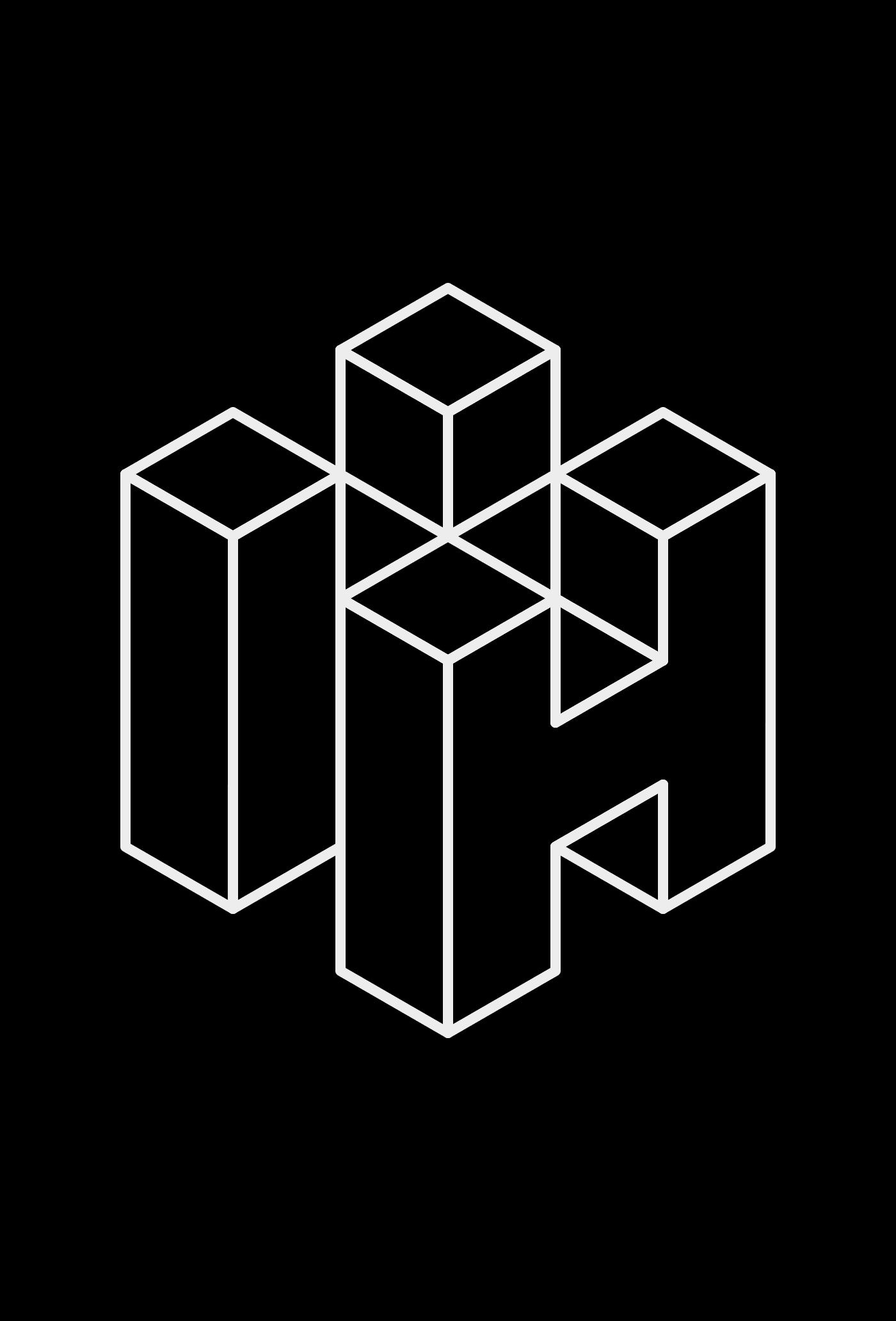
The concept was inspired by the location of the first and most important Hotel and Resort to be built by the company. This first construction is located on a cliff above the sea with a wonderful view. The naming and symbol try to recreate that vision.
Client
100% Noir
Location
Algarve, Vilamoura
Role
Creative direction, Visual Identity & Logo Design
Share


Symbol
Inspiration & concept for the symbol design.

Business cards
Standard and premium version.

Brand elements
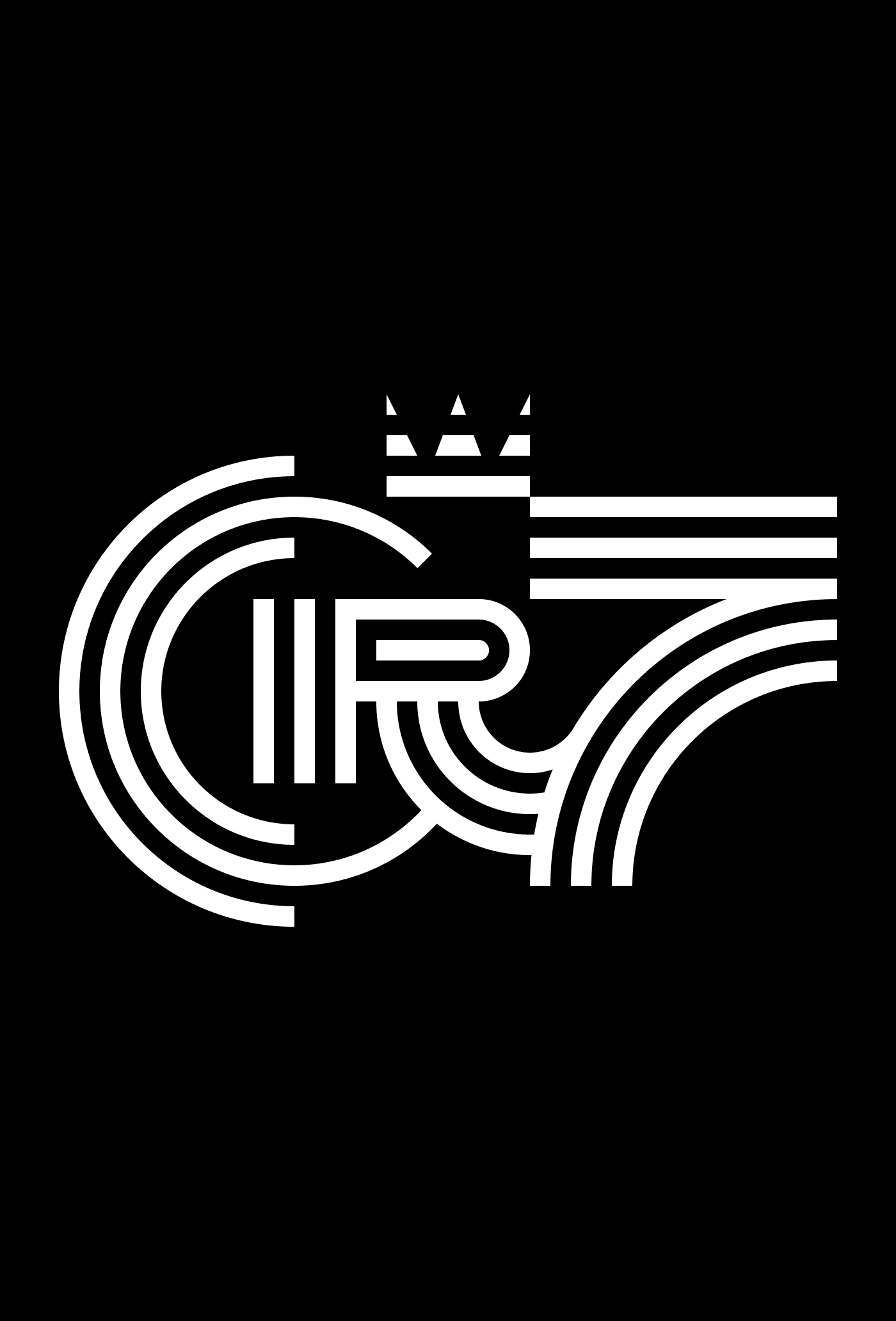
Wordmark, Symbol & colors.


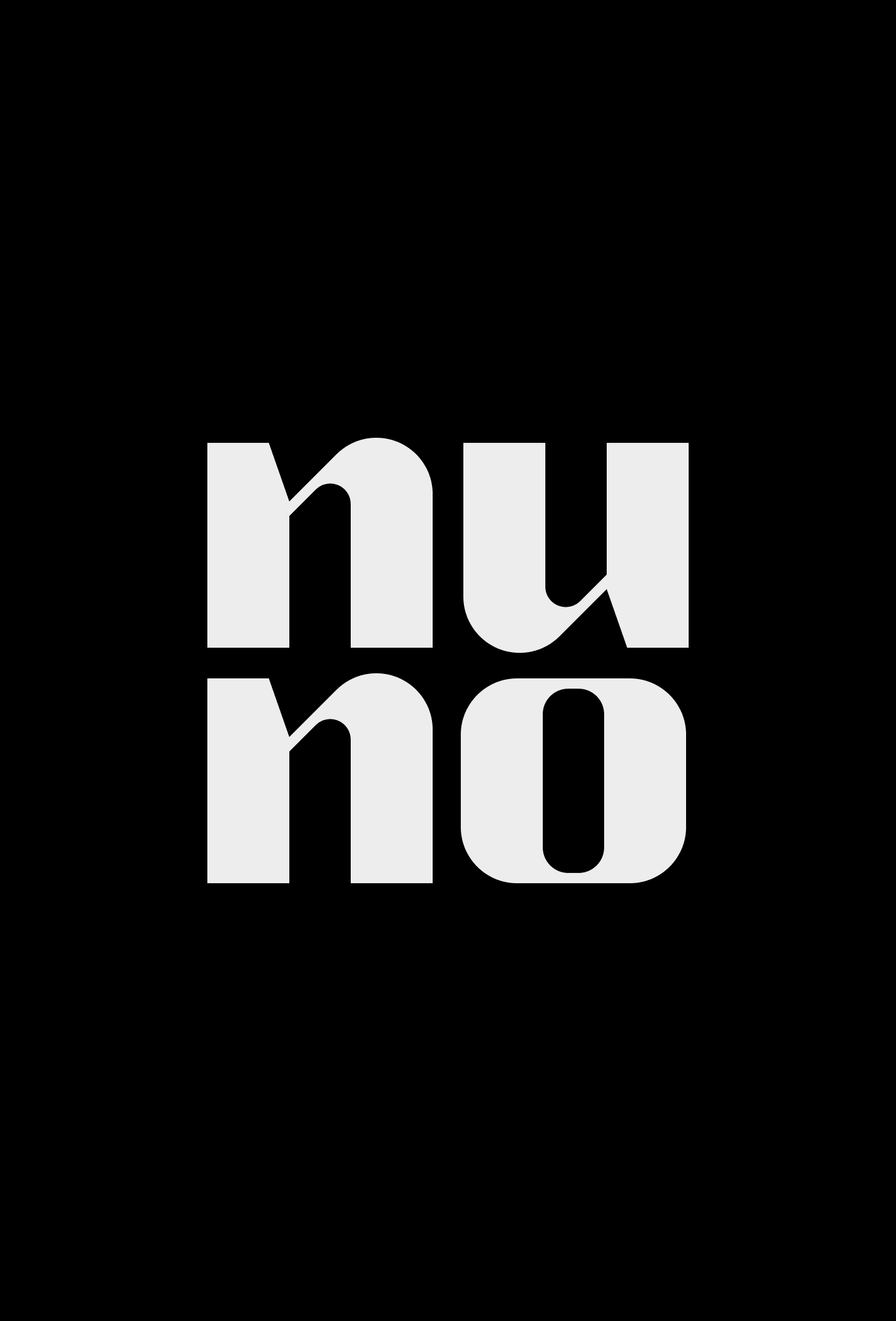
Wordmark
Custom letter design.


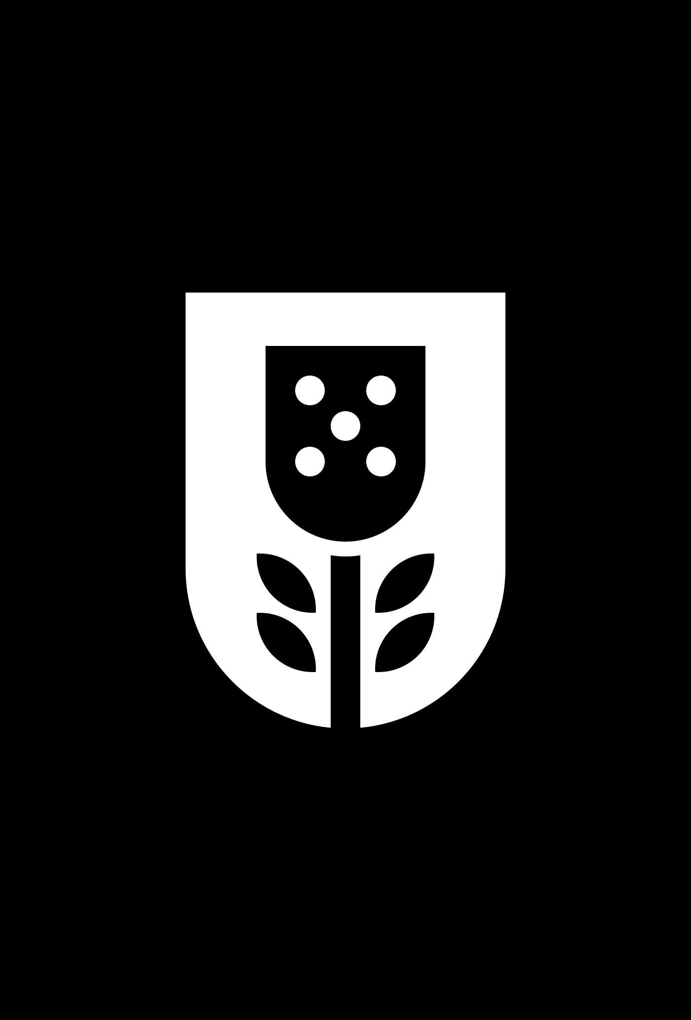
Symbol
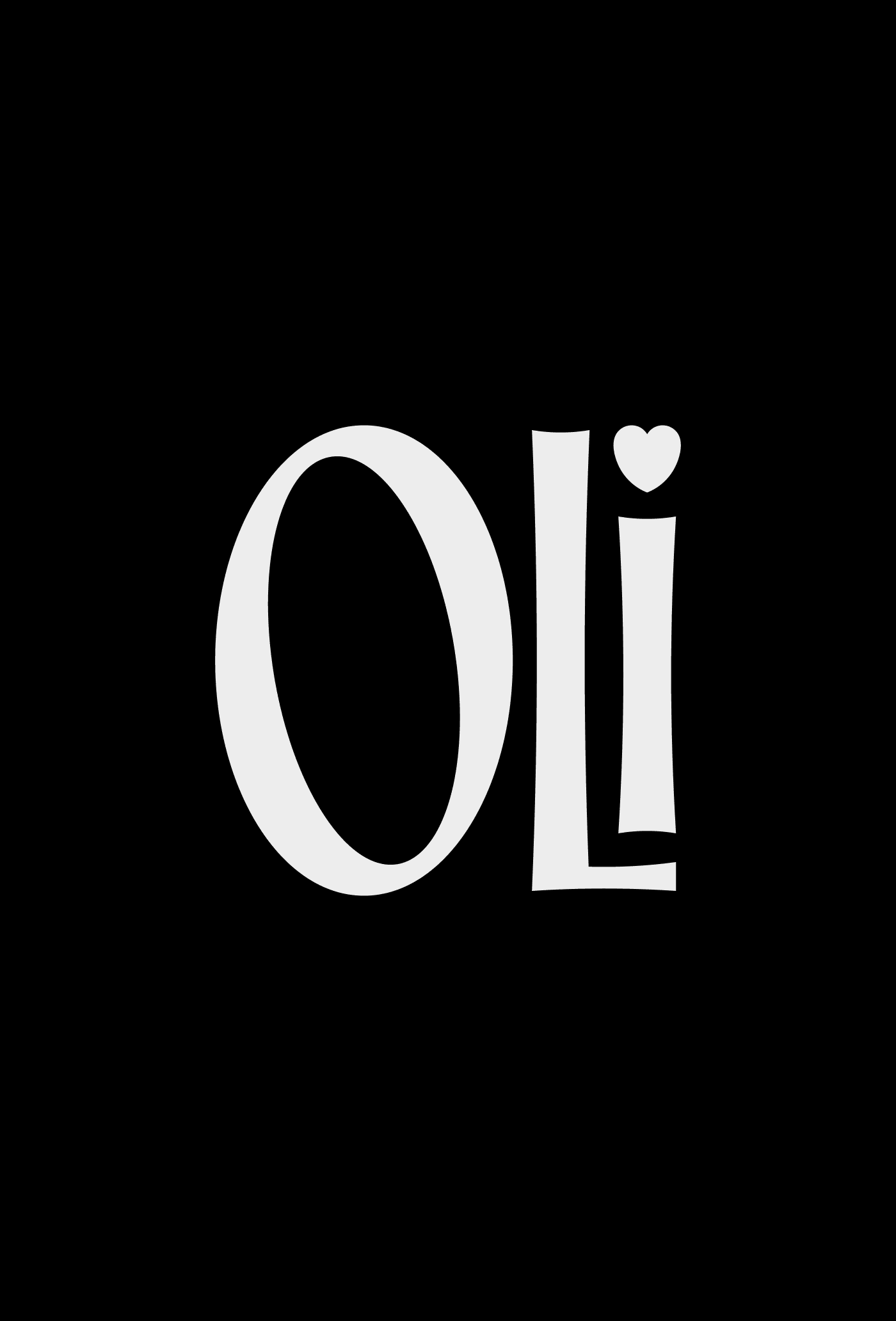
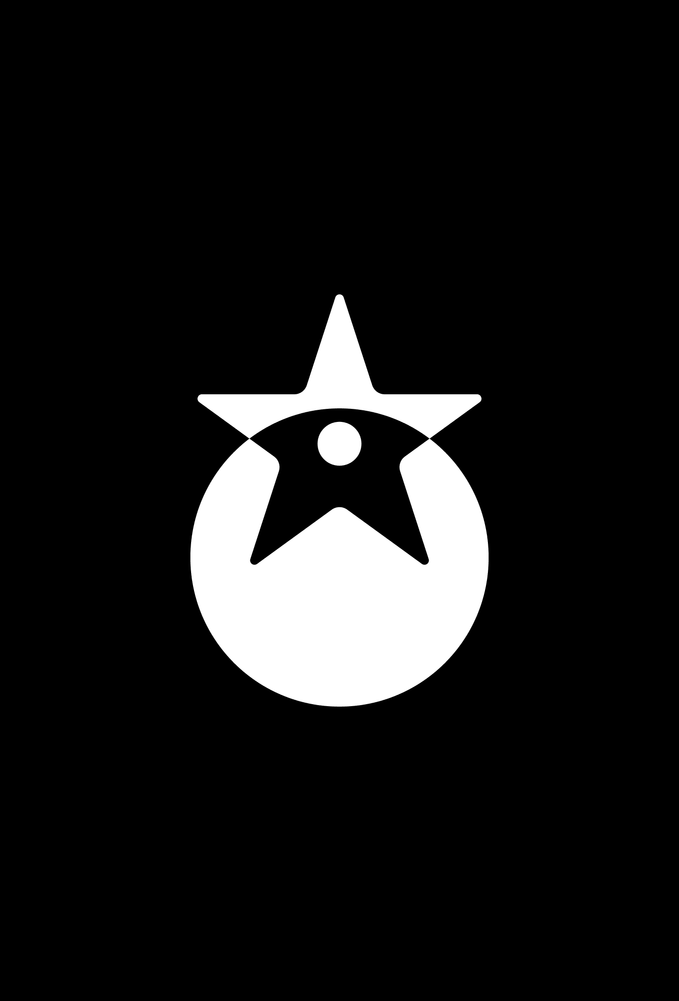
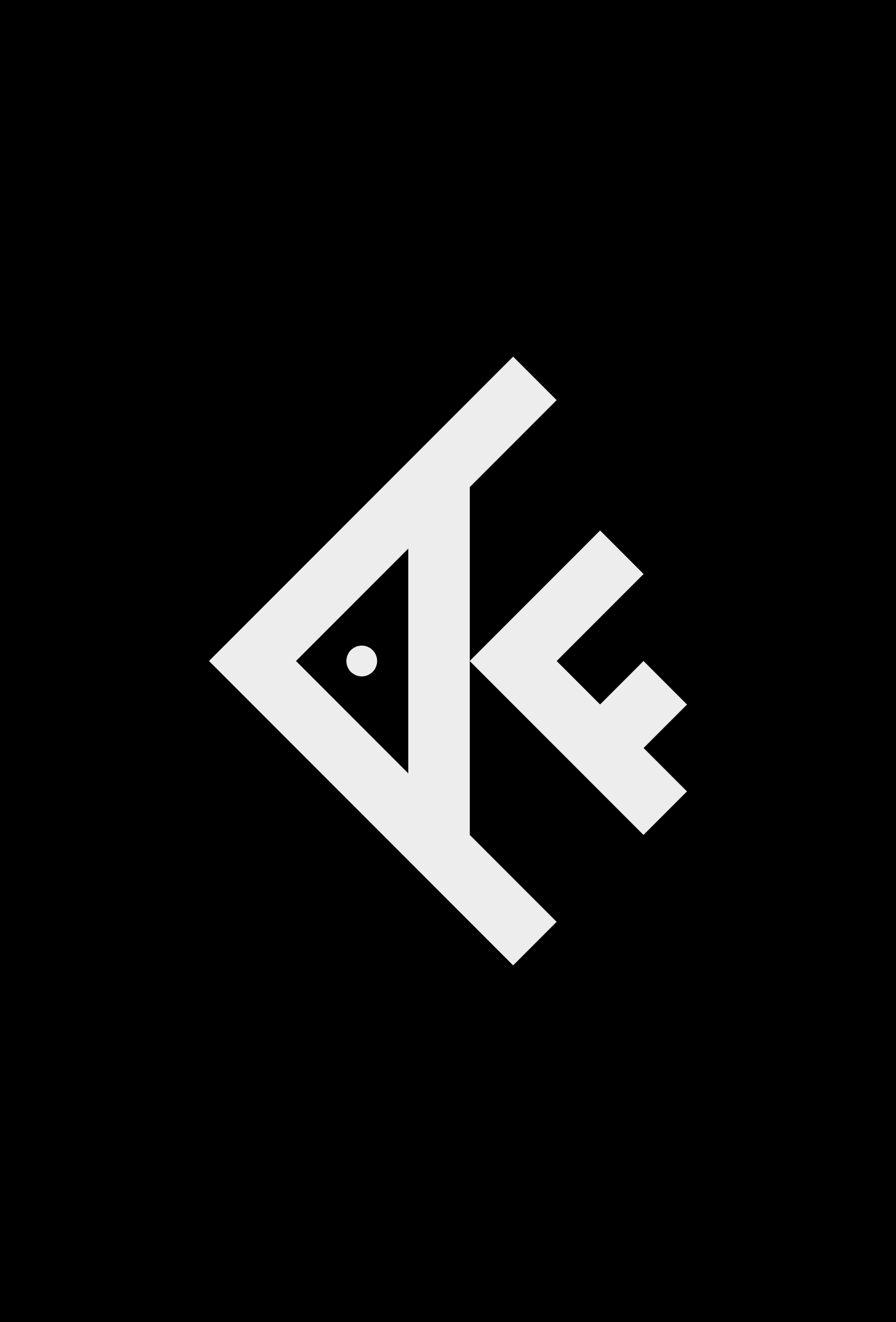
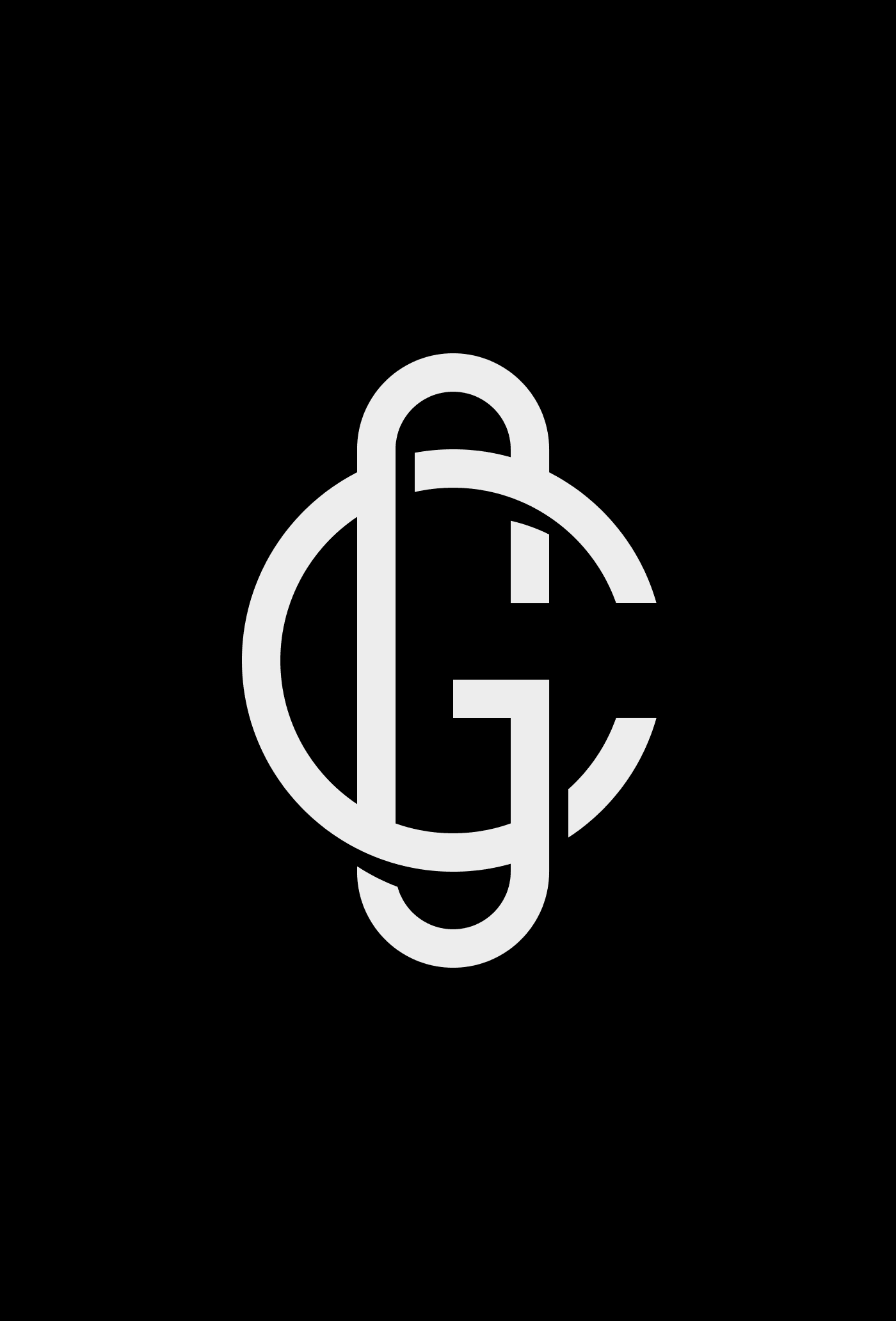
Variations of the symbol for the respective locations of the hotels and resorts. Portugal, Scotland, Angola, and Alaska.


Your brand should be communicated, felt, and lived by people through unique and unforgettable experiences. I would love to hear about your ideas. Get in touch.
Let's connect
Your brand should be communicated, felt, and lived by people through unique and unforgettable experiences. I would love to hear about your ideas. Get in touch. info@brunosilva.design
Let's connect




© 2026 Bruno Silva – Brand Designer & Strategist