
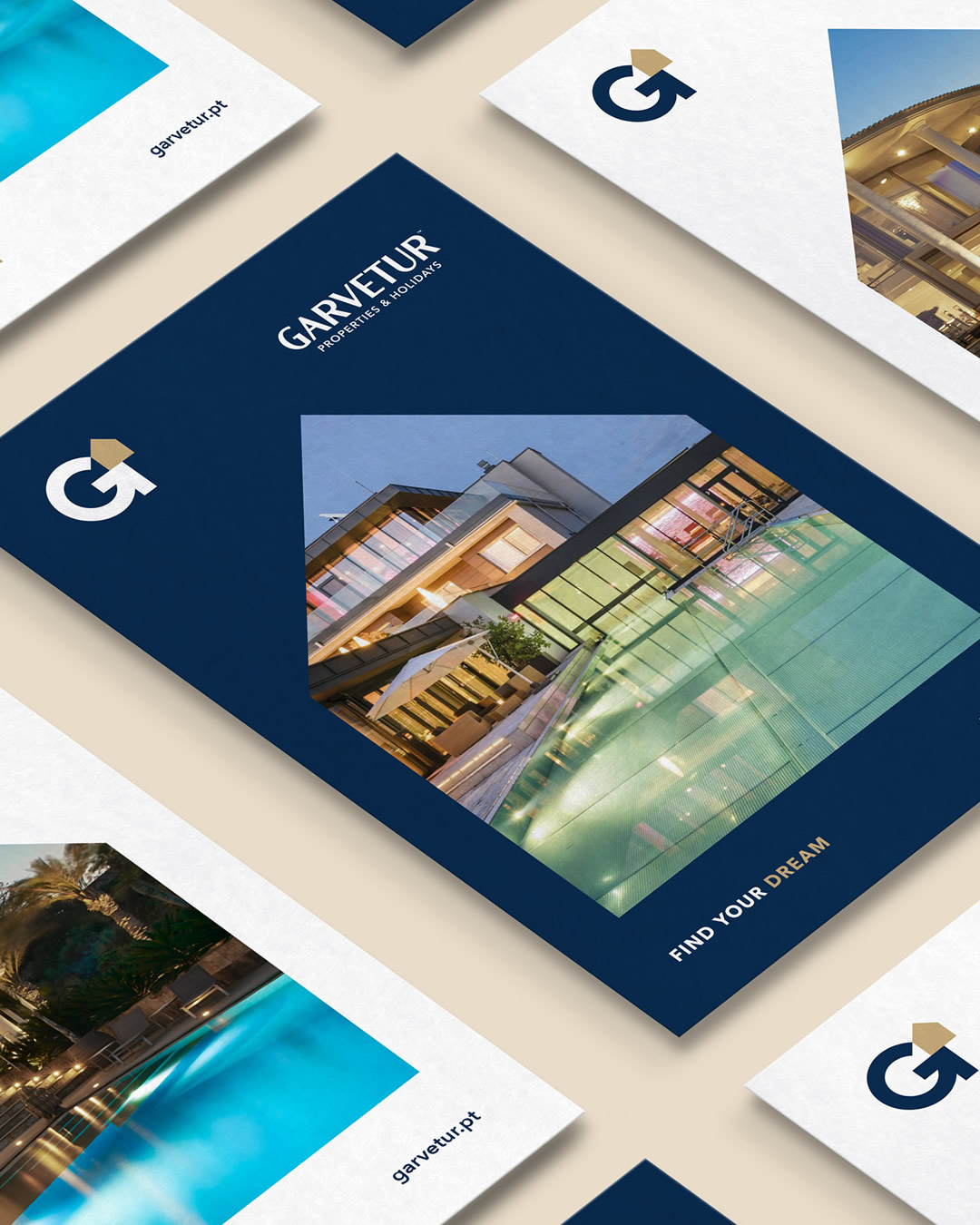
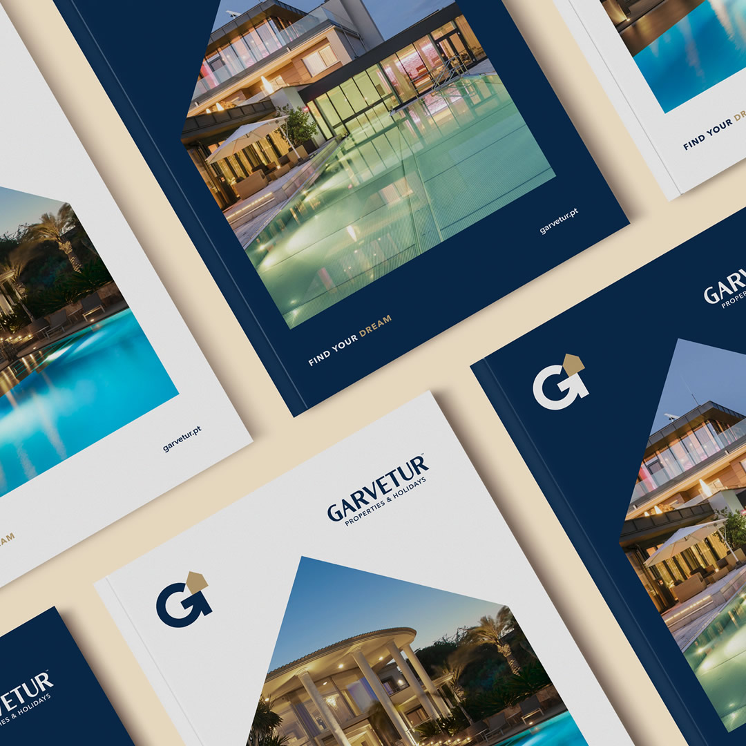
Garvetur, Properties & Holidays
To redefine, redesign and give a clear and direct purpose to the brand.
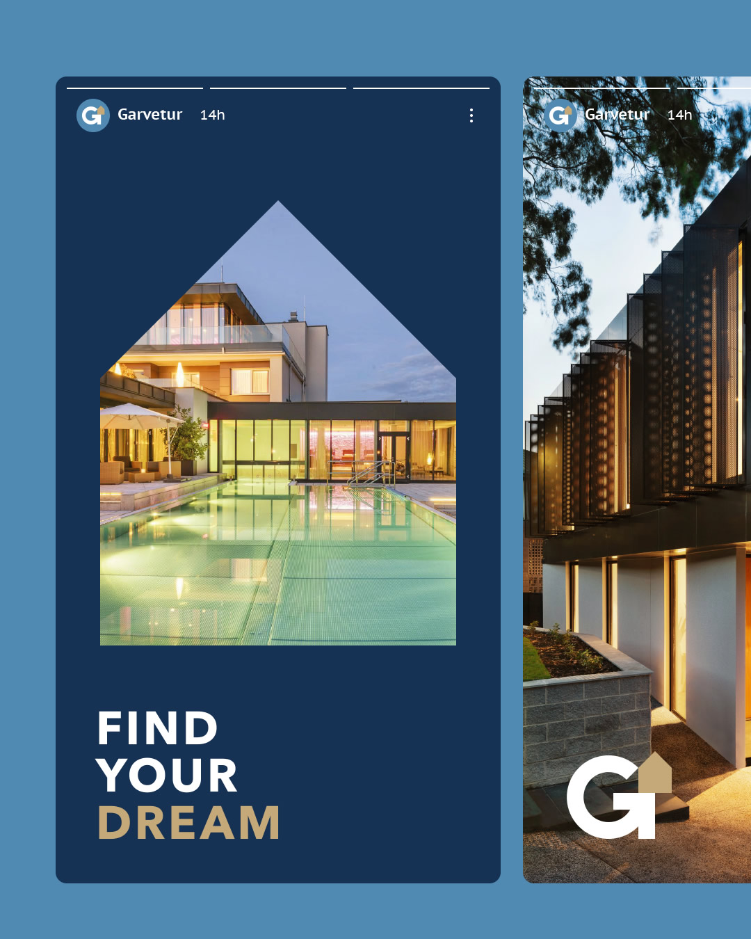
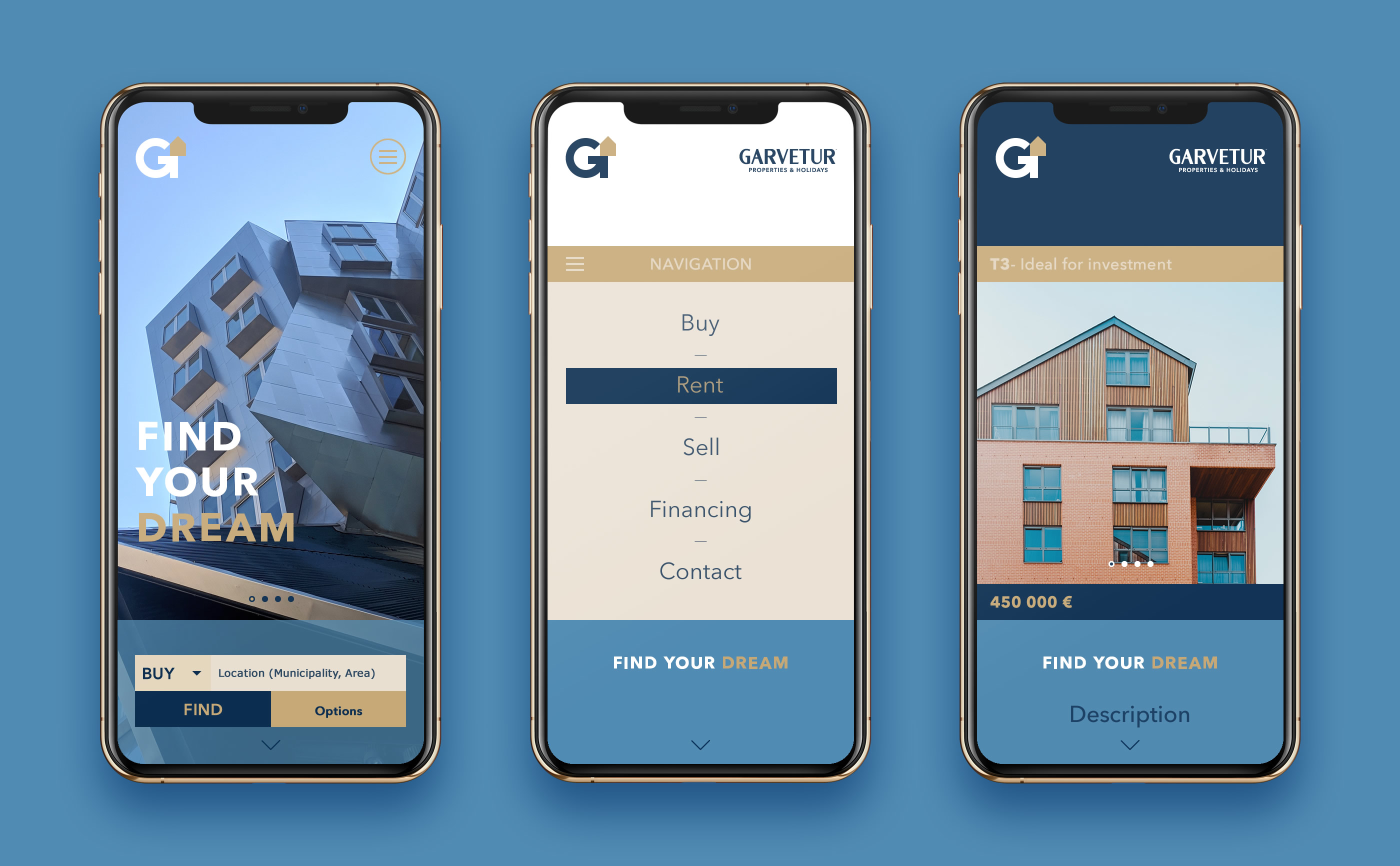
The aim was to create a graphic language more suited to the brand's mission and positioning. A clear and noise-free language. With communication that emotionally interacts with people.
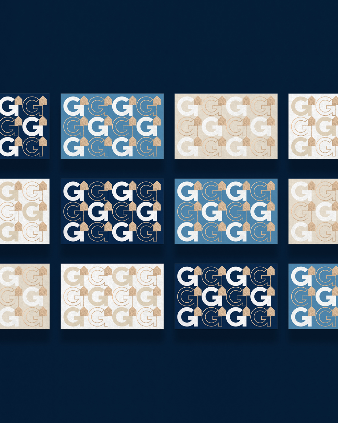
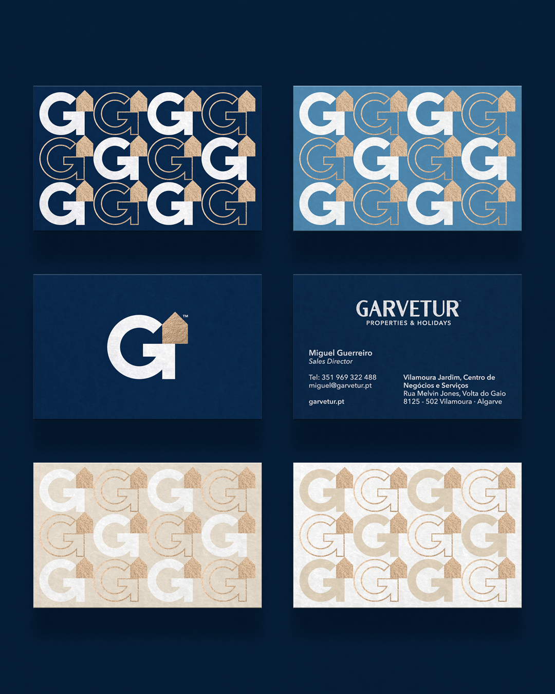
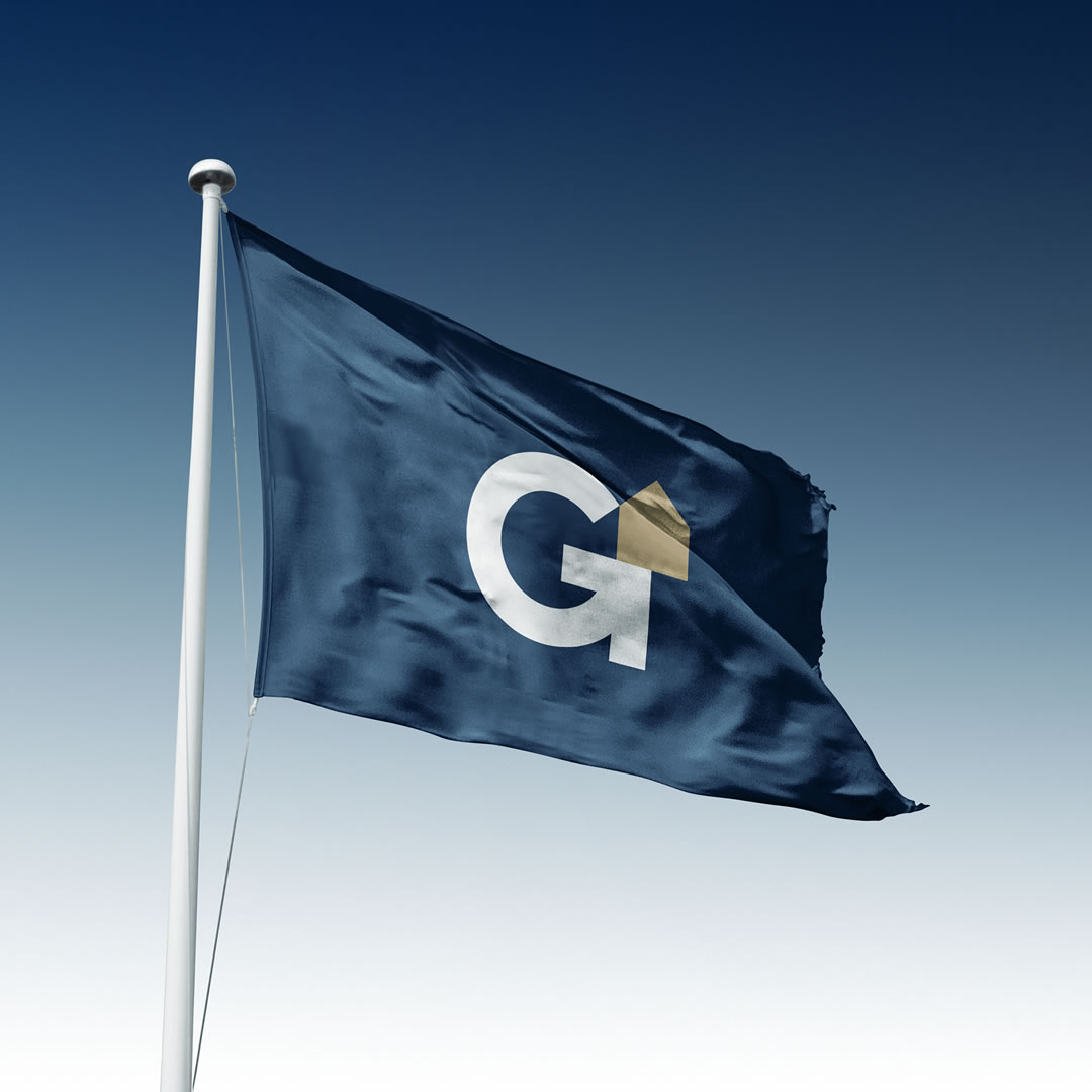
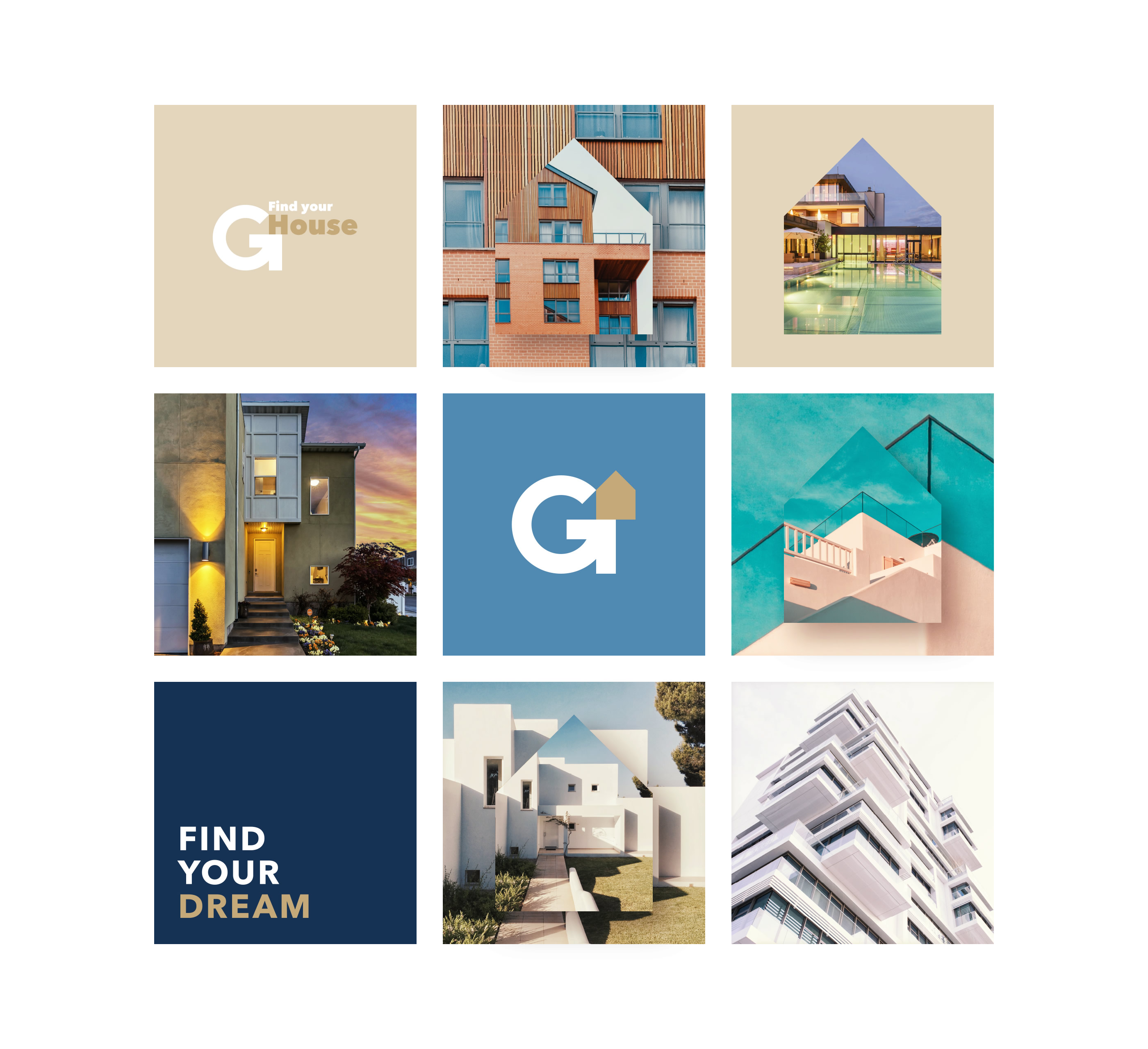
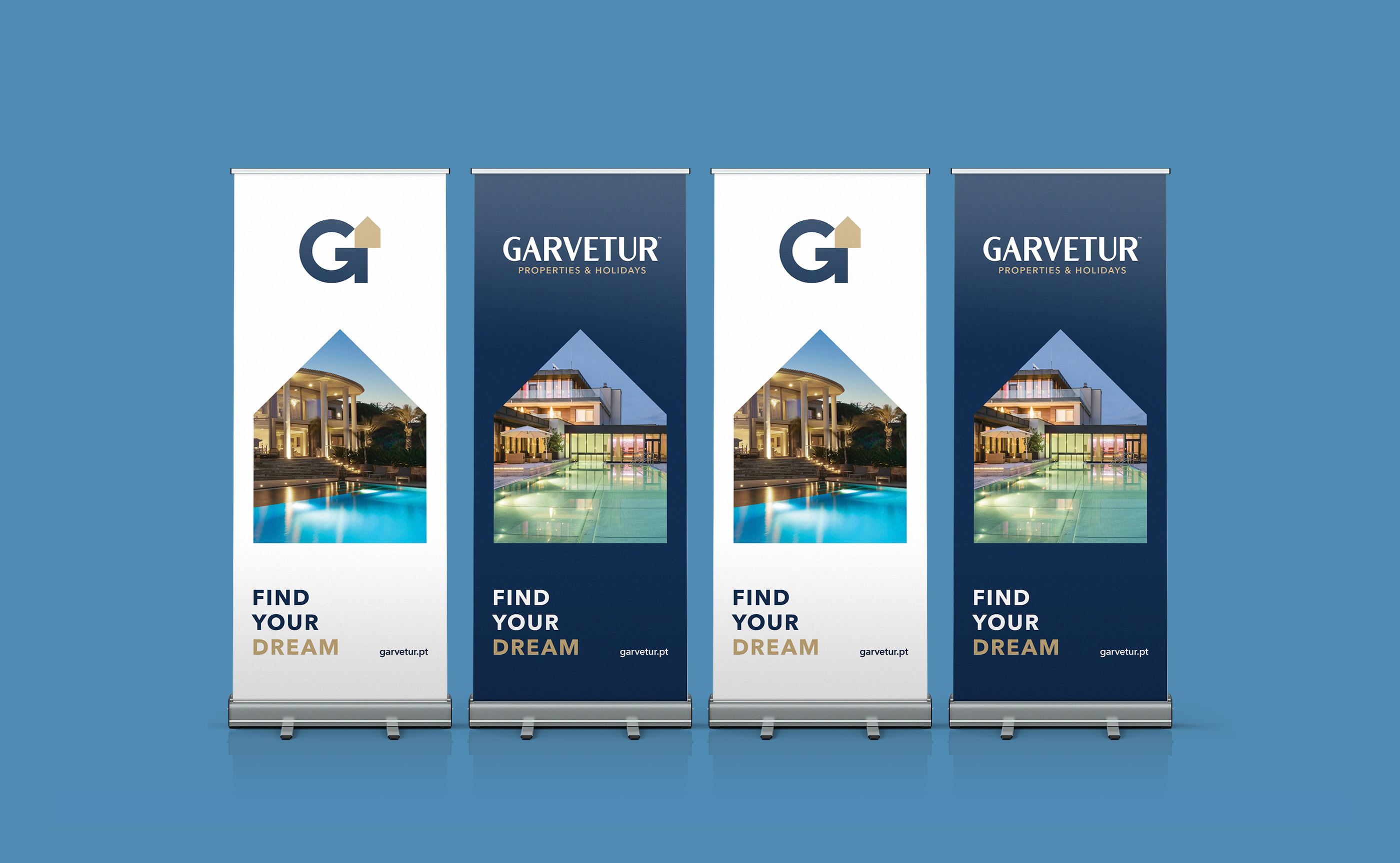
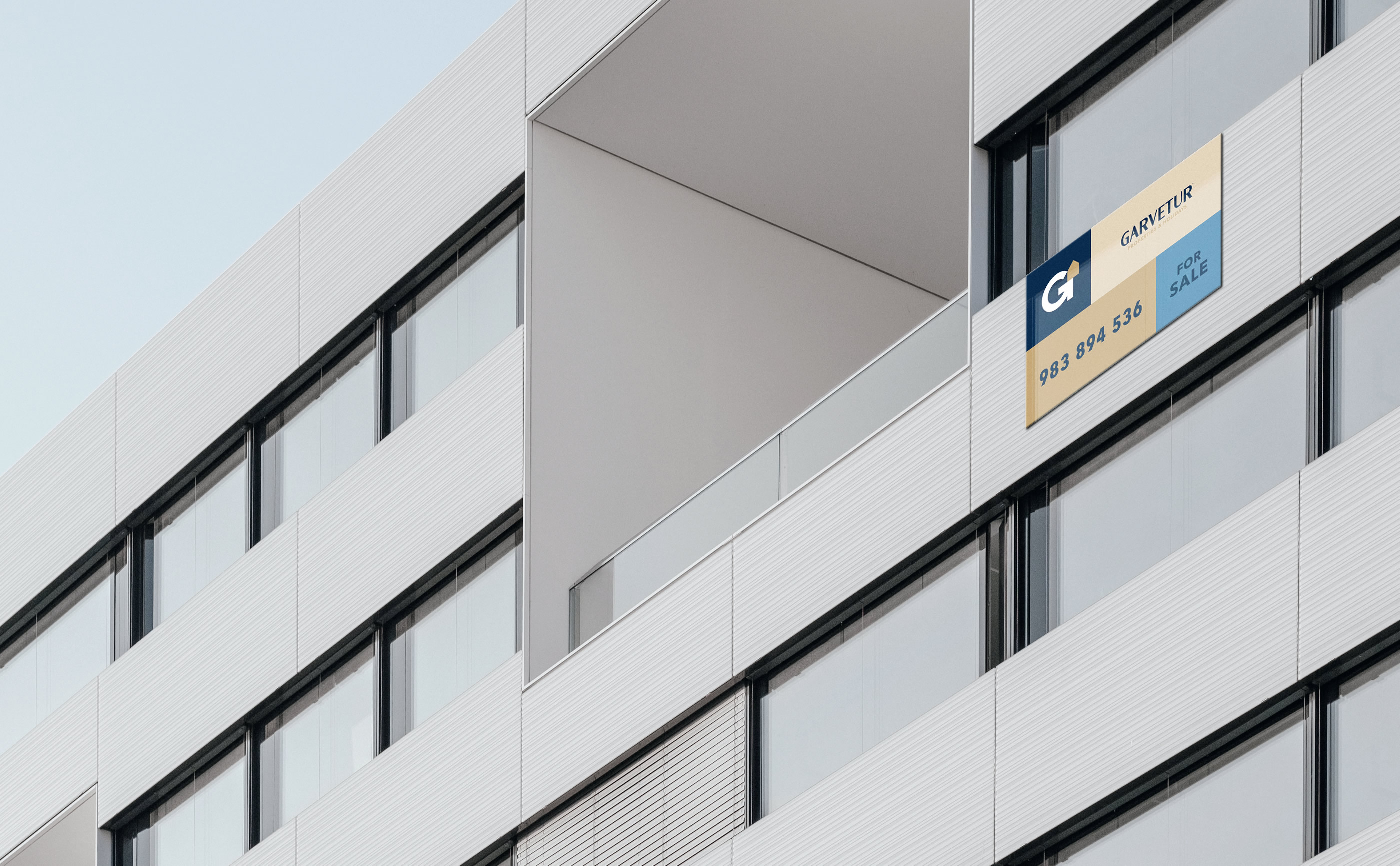
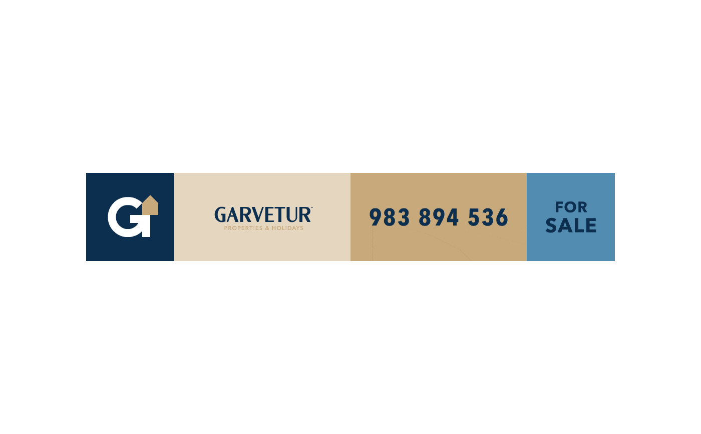
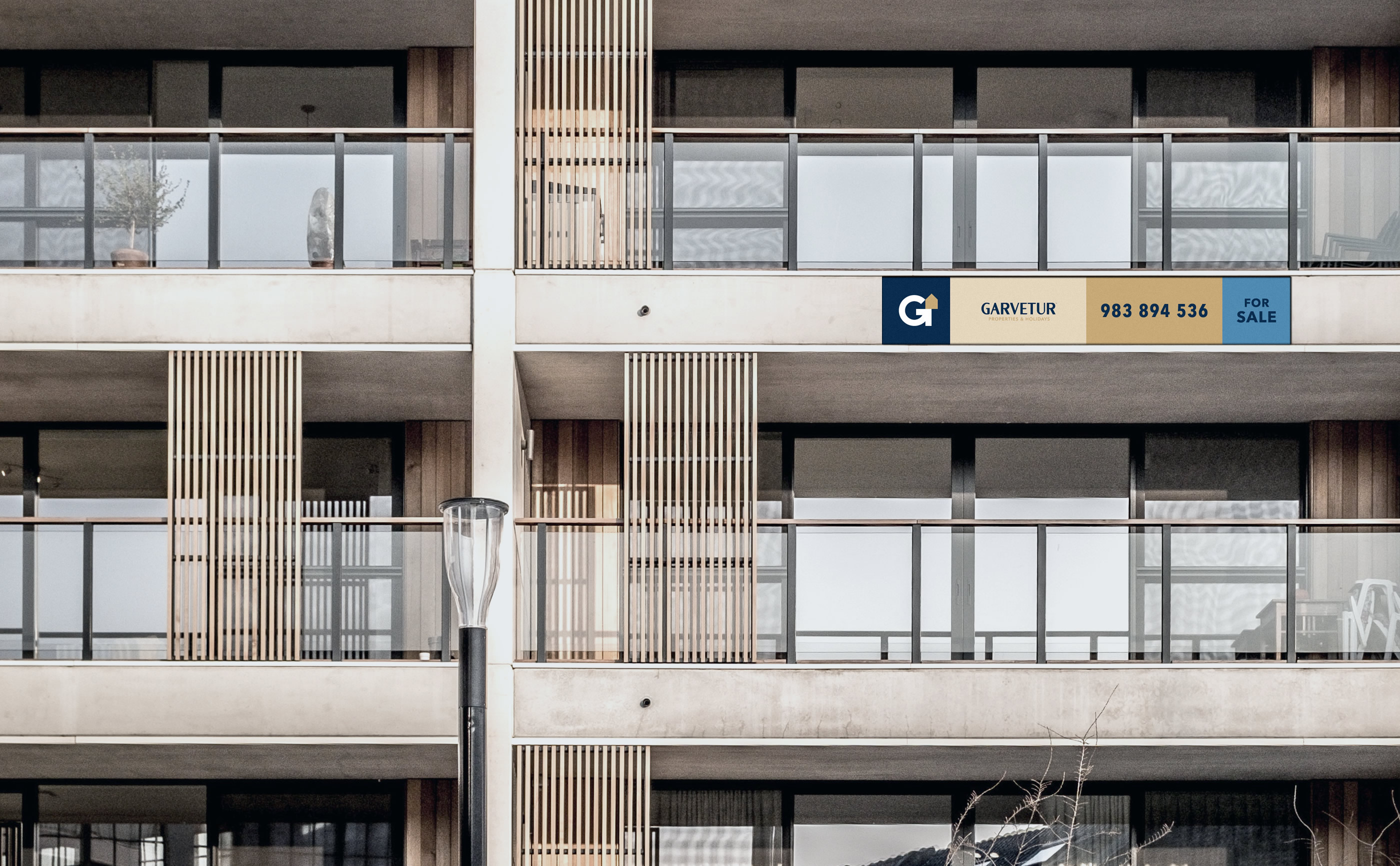
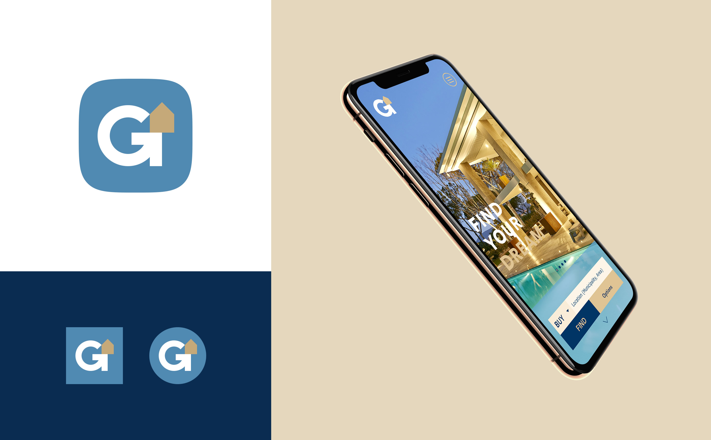
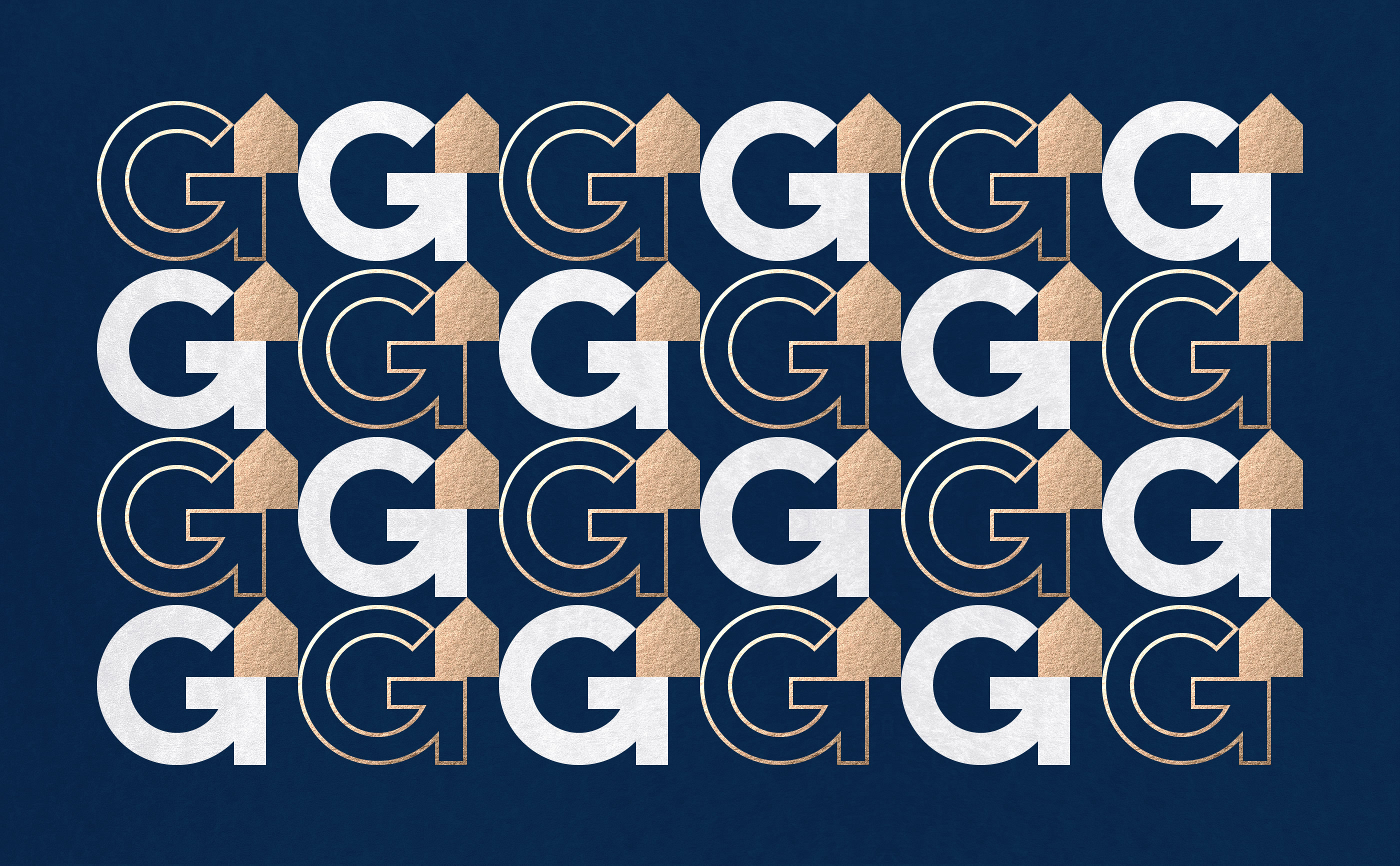
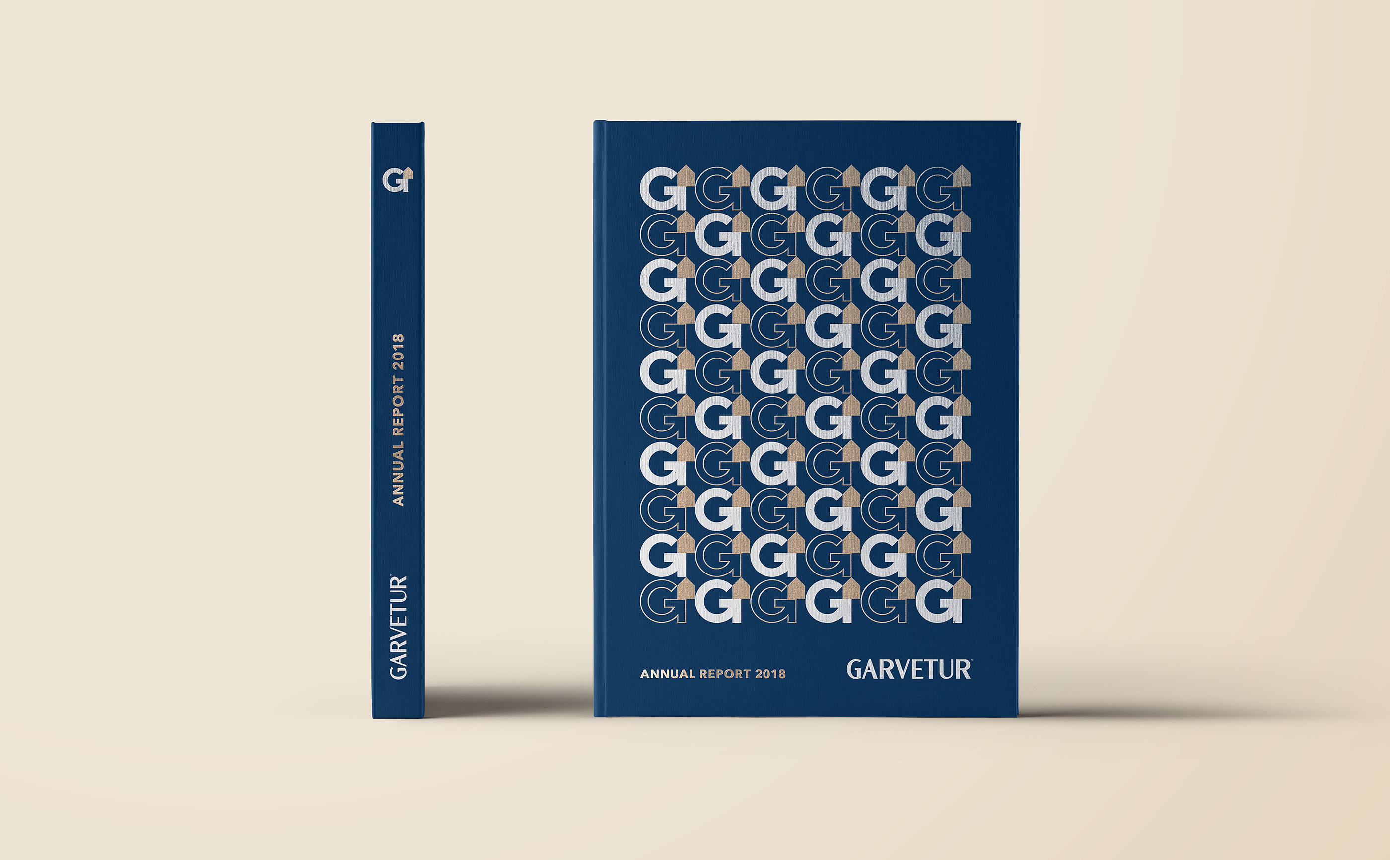
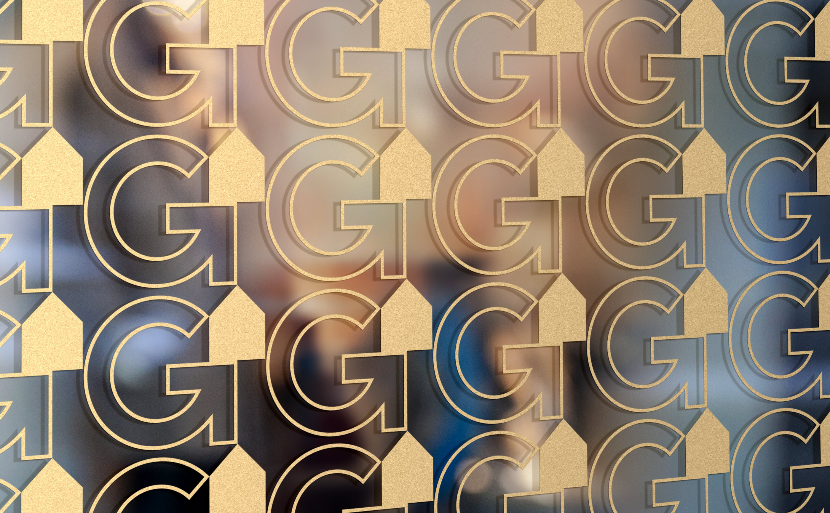
We designed a bold and dynamic visual identity that represents the brand's values and purpose.
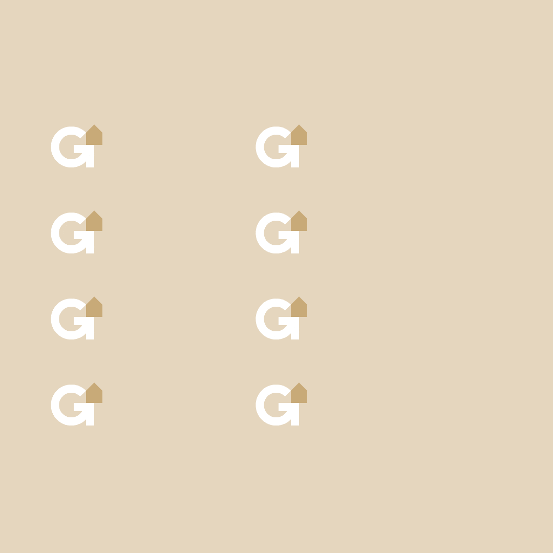
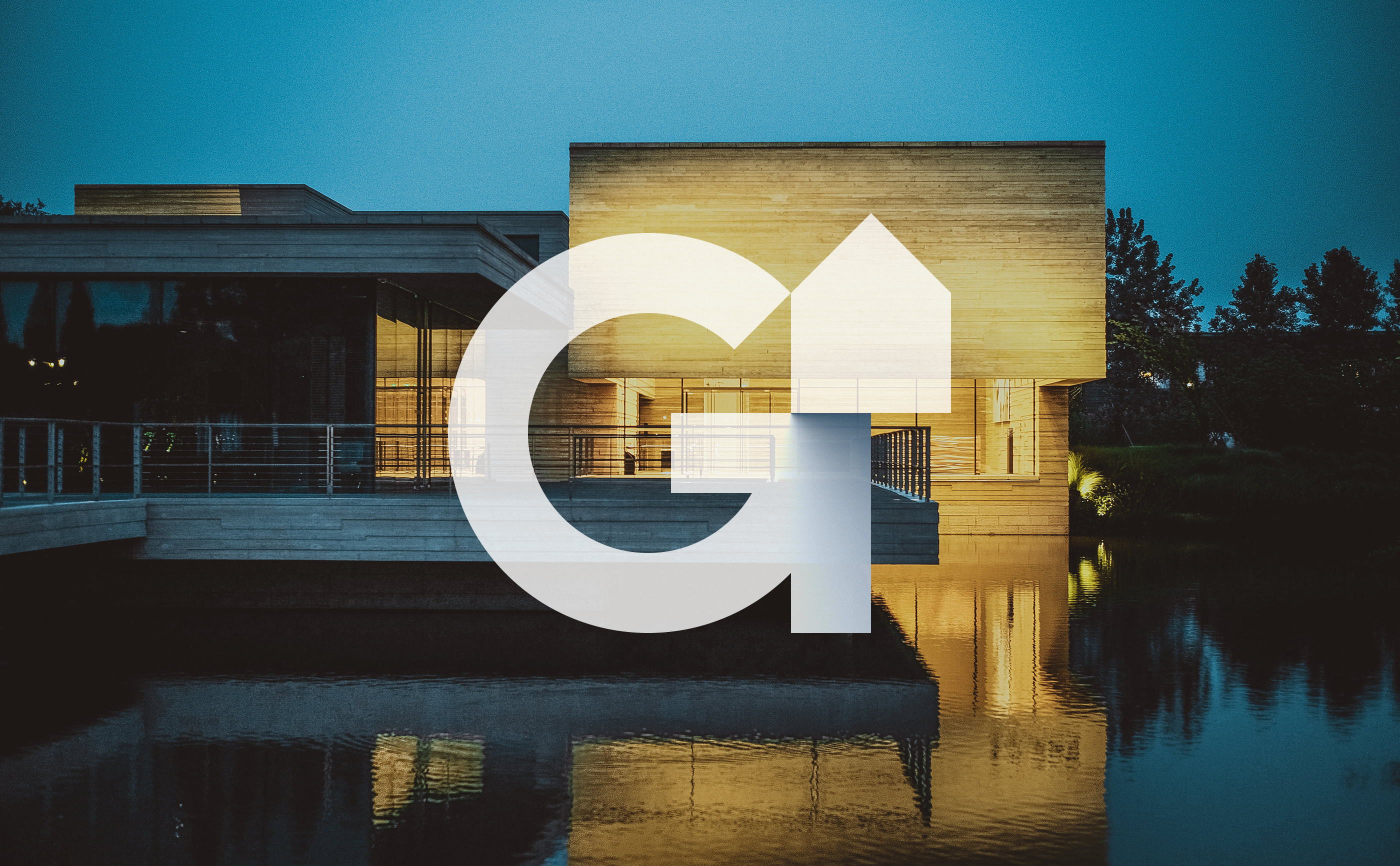
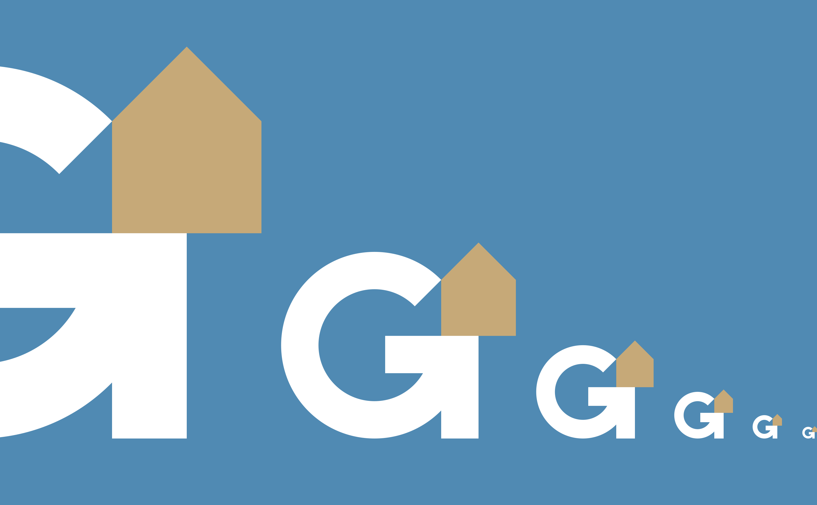
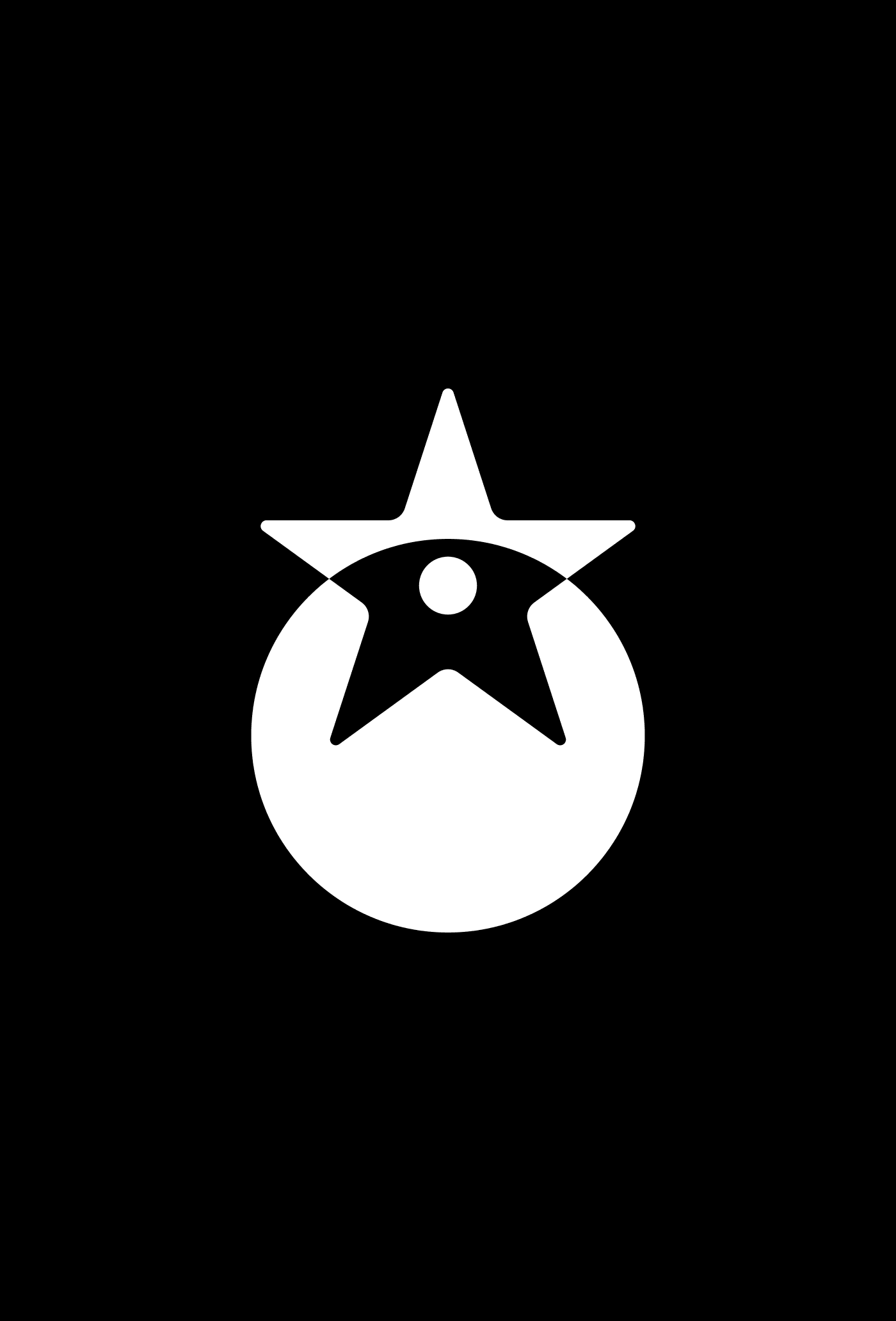
The symbol created reflects the company's core mission in a clever way. The concept created between the ambiguity of the letter G with the arrow pointing towards the goal is an impressive way to identify the brand.
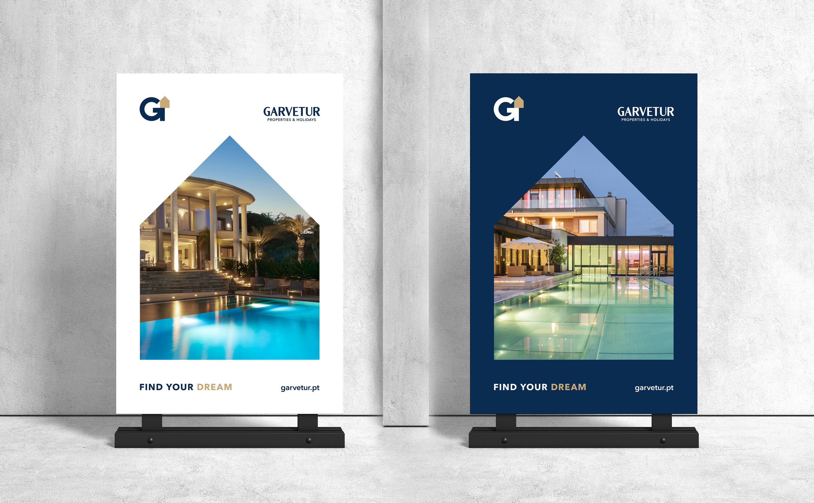
FIND YOUR DREAM HOME...
Client
Enolagest
Location
Algarve, Vilamoura
Role
Creative direction, Visual Identity, Logo & Web design
Share


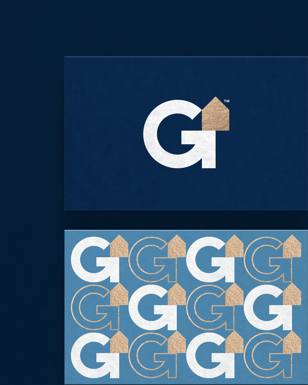
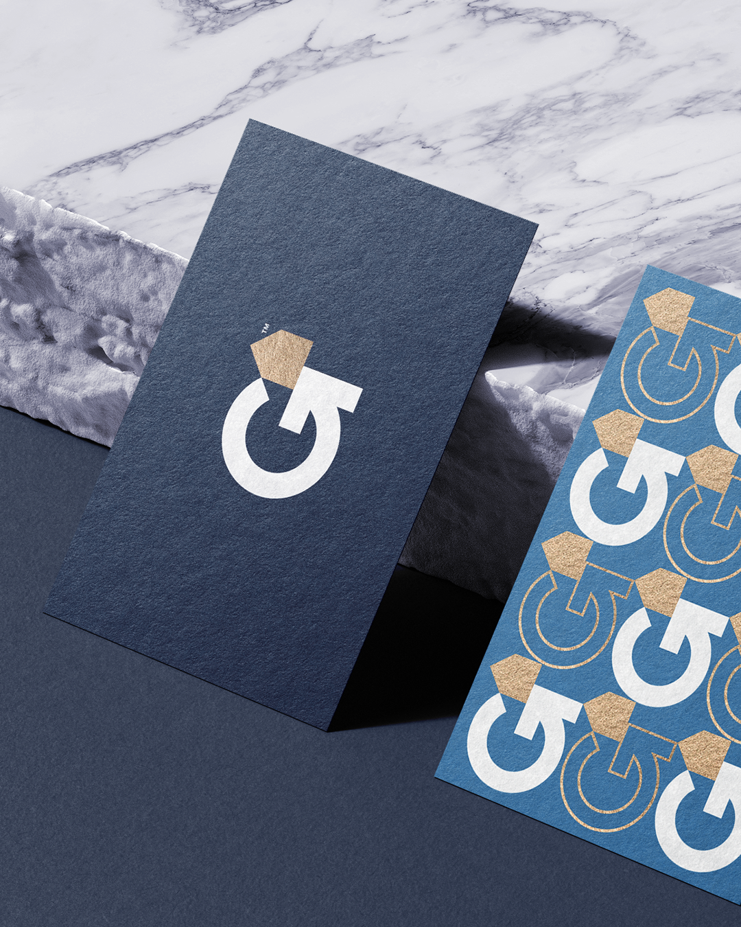
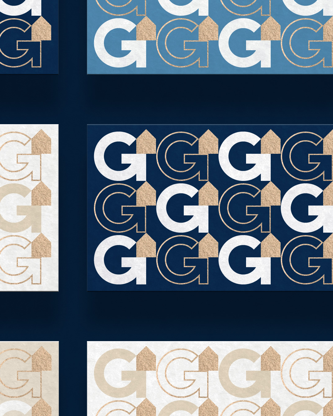

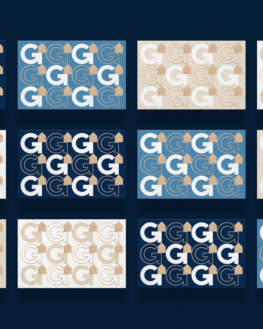

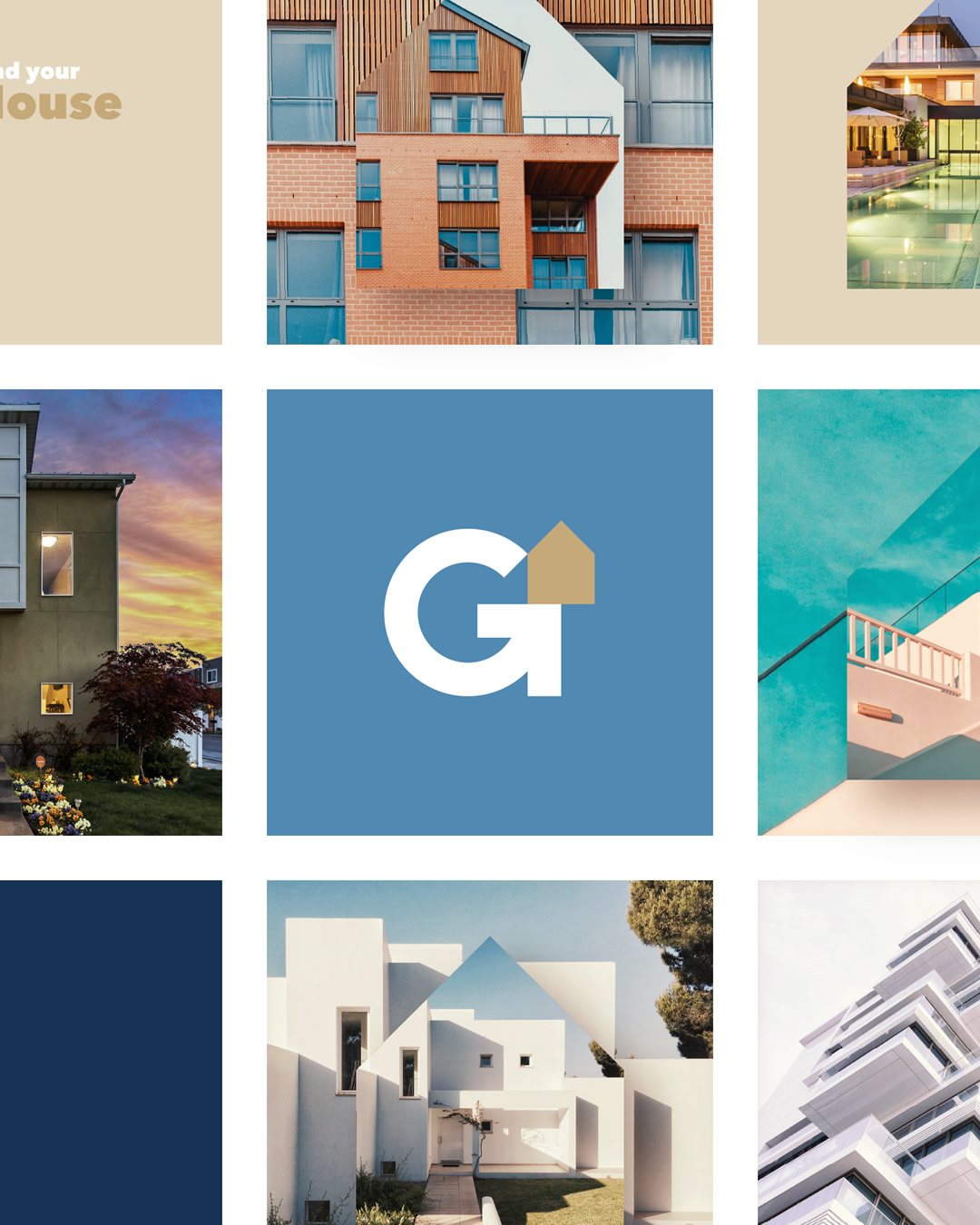


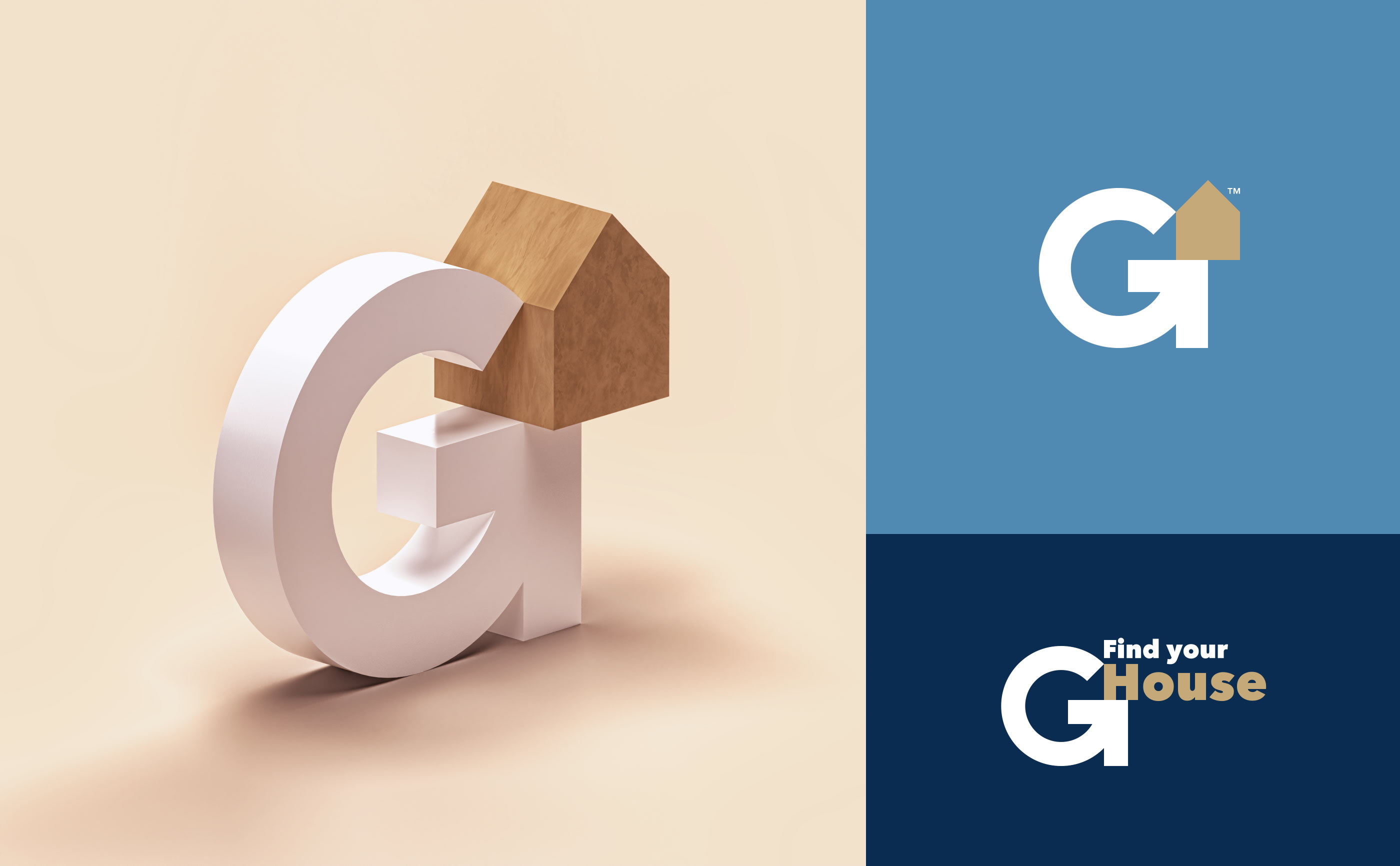
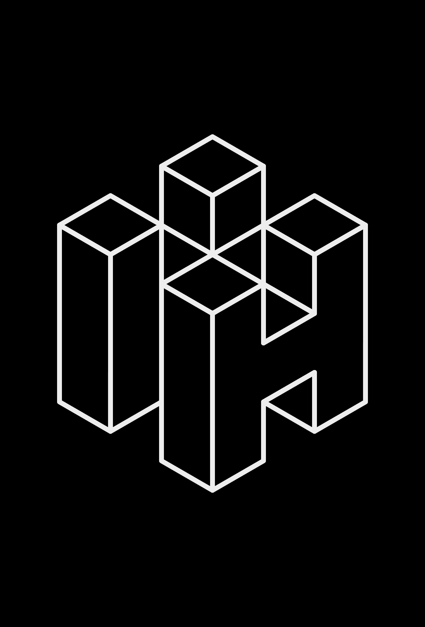
Concept for the new symbol
The three elements that form the symbol and their meanings.
G letter + Arrow + House
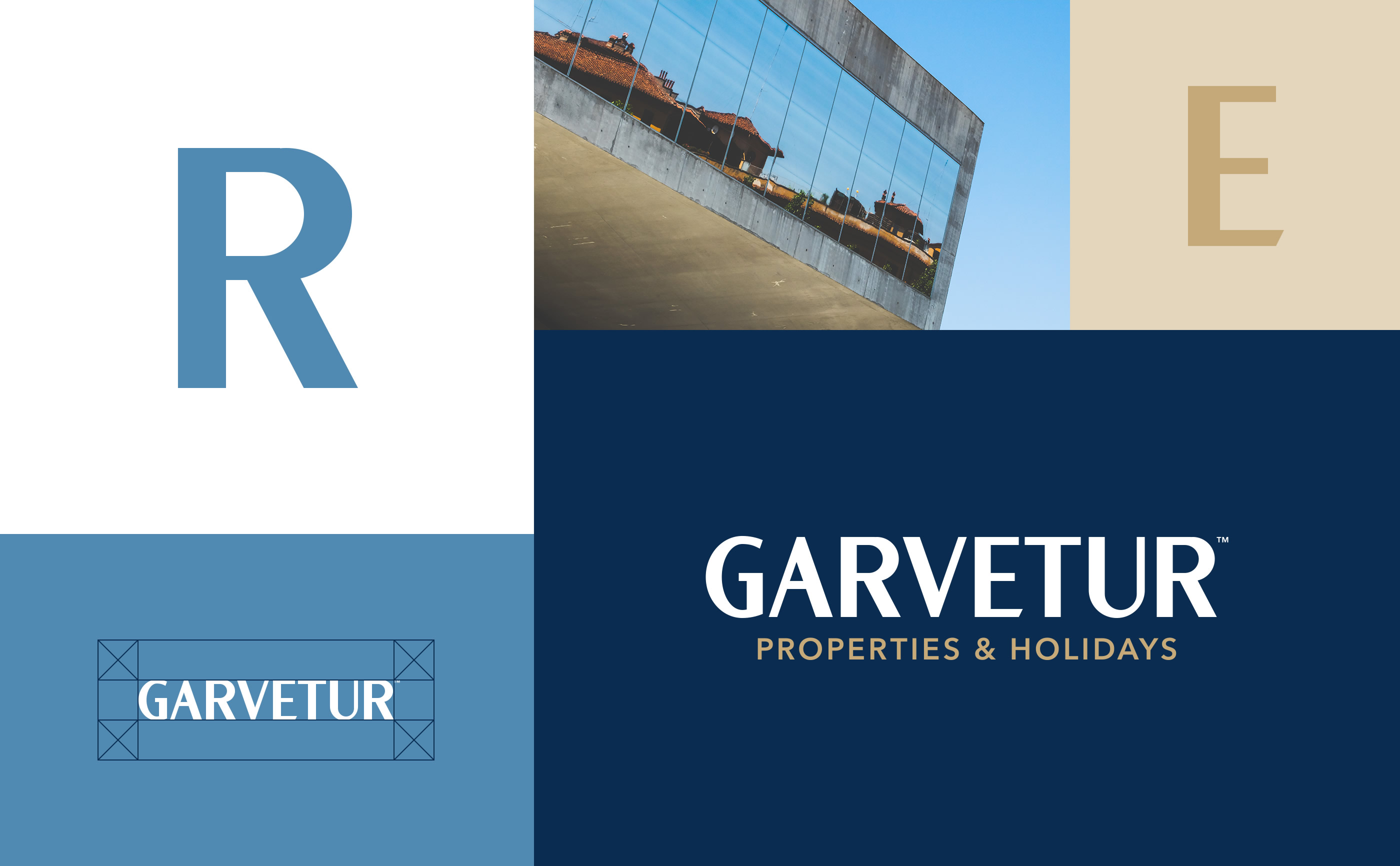
Old Logo
G
Garvetur
Letter G
Global
Internacional

Arrow
Direction
Address
Guide
Line
Route
Path
Point
Show
Indicate
Point to
Find
Identify
Target

House
Home
Building
Construction
Roof
House
Accommodation
Lodge
Space
Shelter
Local
Site
Spot
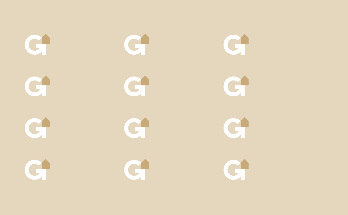
New Logo Proposal
Symbol
Dynamic and flexible.


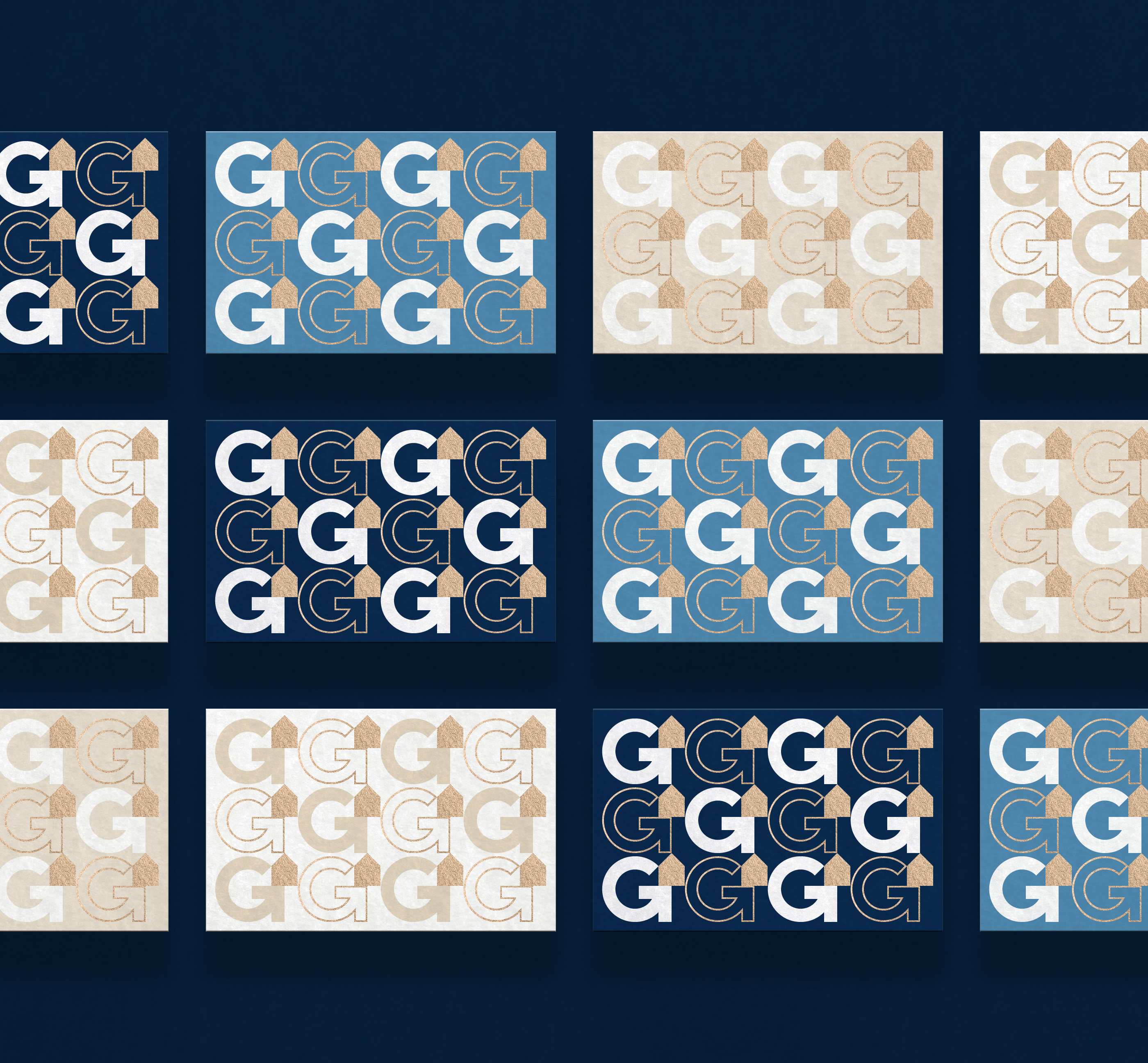


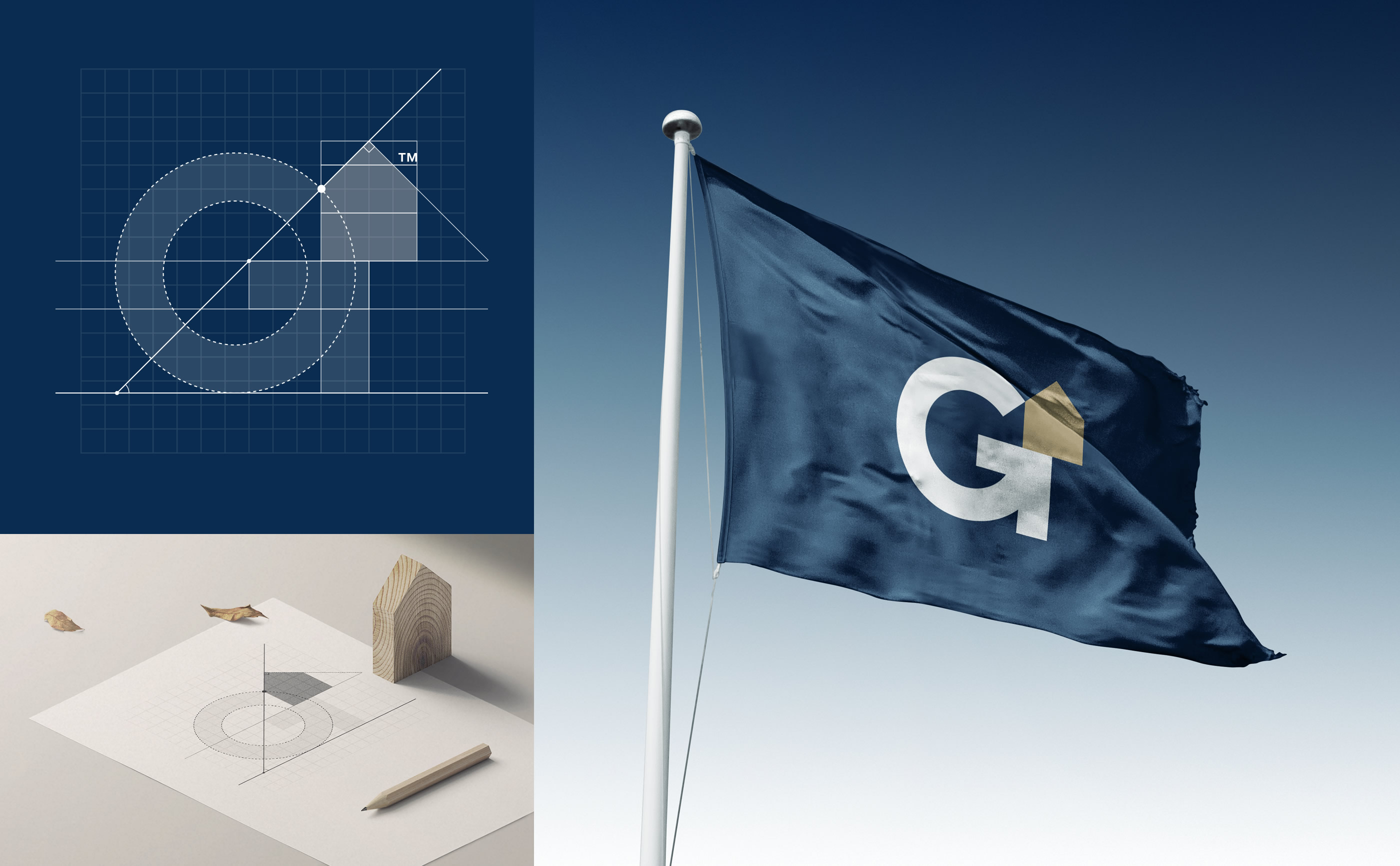

Wordmark
Custom letter design.


Your brand should be communicated, felt, and lived by people through unique and unforgettable experiences. I would love to hear about your ideas. Get in touch.
Let's connect

Your brand should be communicated, felt, and lived by people through unique and unforgettable experiences. I would love to hear about your ideas. Get in touch. info@brunosilva.design
Let's connect


© 2026 Bruno Silva – Brand Designer & Strategist
